

Two Left Hands
There is a brief scene from a well-known essay where the cop calls out to the unsuspecting person on the street. “Hey, you there!” That is almost all the description that the philosopher provides. I imagine France because of the man who wrote it. I imagine Paris, a Godard or Truffaut film in black and white and the backdrop of a spacious, bright Haussmannized boulevard. What I see is vague, just people more dressed up than today walking on the near side and the far side, and cars and small delivery trucks in the middle space. The person receiving the cop’s message is unnamed, remains undescribed except for their looking over their shoulder, but was always constituted by ideology handed over by our cultural institutions and rituals—so we are told elsewhere—from birth.
There is no outside to this situation. Still, the person’s response to the call, the assumption that it was for them, is important, we read in the essay. The head turn, acknowledgement of having been called, the attention given. For me and not for someone else.
I thought of this scene because of another thing I was writing that included the cop. And I thought back to when I first read the essay thirty years ago in art college.
When I replay versions of that scene from my own life, the caller is not a cop. I think of the call for pitches from a magazine whose messages come to my in-box. I think of the phone call announcing a friend’s death, the news that I absorbed indirectly from my now-spouse’s face. I think of being called upon at a meeting though my hand was not raised. I think of a robocall. I think of results from the doctor and a sales pitch to offer me money for a PhD program. I think of a nineteen-year-old1 woman who flagged me down on the street. “Hey, Malcolm. Do you remember me?” I was on my bicycle at a stoplight, she was walking. I did remember her. That was twenty-five years ago.
A few months back, out of the blue, I was called on for a book design. One to be done very quickly. I can’t remember my mood before the message, but I always like to be asked to do something like this, to do a design, even for little or no money, so I must have been uplifted after receiving the message. I must have felt seen and for some reason, probably a very basic human reason, this is something I often desire. At the same time, other work overwhelmed me: essays to mark, manuscripts to edit, a poster to design for a music night. The book cover might take ten or more hours to do.
The book was about agency, and I thought of a hand to show agency. One has to think of emblematic images when designing a book cover, embodying ideas in things, like a Flemish master would objects in the foreground of the painting, fruit representing some religious thing. What kind of hand, what gesture, hadn’t occurred to me.
I didn’t immediately think of my spouse’s hand, just a hand, just the idea of a hand as the cover’s focus. In the same way that you might carry around the idea of a chair and identify things in the world as chairs. When I design, I often do not know any details until they appear to me, often by accident, in the world or on the screen. I need to see them; I don’t imagine them. This is a process that people like to avoid talking about.
I went searching for hands and found a pastel drawing, just a hand without the rest of the body, from a hundred and seventy-five years ago. I had been thinking about out-of-focus as a design strategy. Out of focus photos. And in fact this pastel drawing of a hand that I took from Wikimedia looked beautiful out of focus, having had the ‘blur’ filter applied in Photoshop. I didn’t understand until later that the low contrast, low-light effect of the mid-nineteenth-century pastel was one of the keys to it looking good out of focus, which was also true of a book cover I’d recently seen of an out-of-focus face, one by Oliver Munday, one of a few that he abandoned as part of the process designing a reissue of book by Fleur Jaeggy. A 1950s snapshot of a woman’s face.
Later it occurred to me that out of focus means the truth has been put in doubt, that truth has receded into the past. The past has consumed the object’s details, smoothed the whole thing over. Everything is a cultural sign, even a photo filter, certainly an object made out of focus by a designer. A book cover is just a play of such cultural signs. Inescapably. Always already, I suppose. You couldn’t make a cover that doesn’t refer to something out there that is weighed down with human affairs.
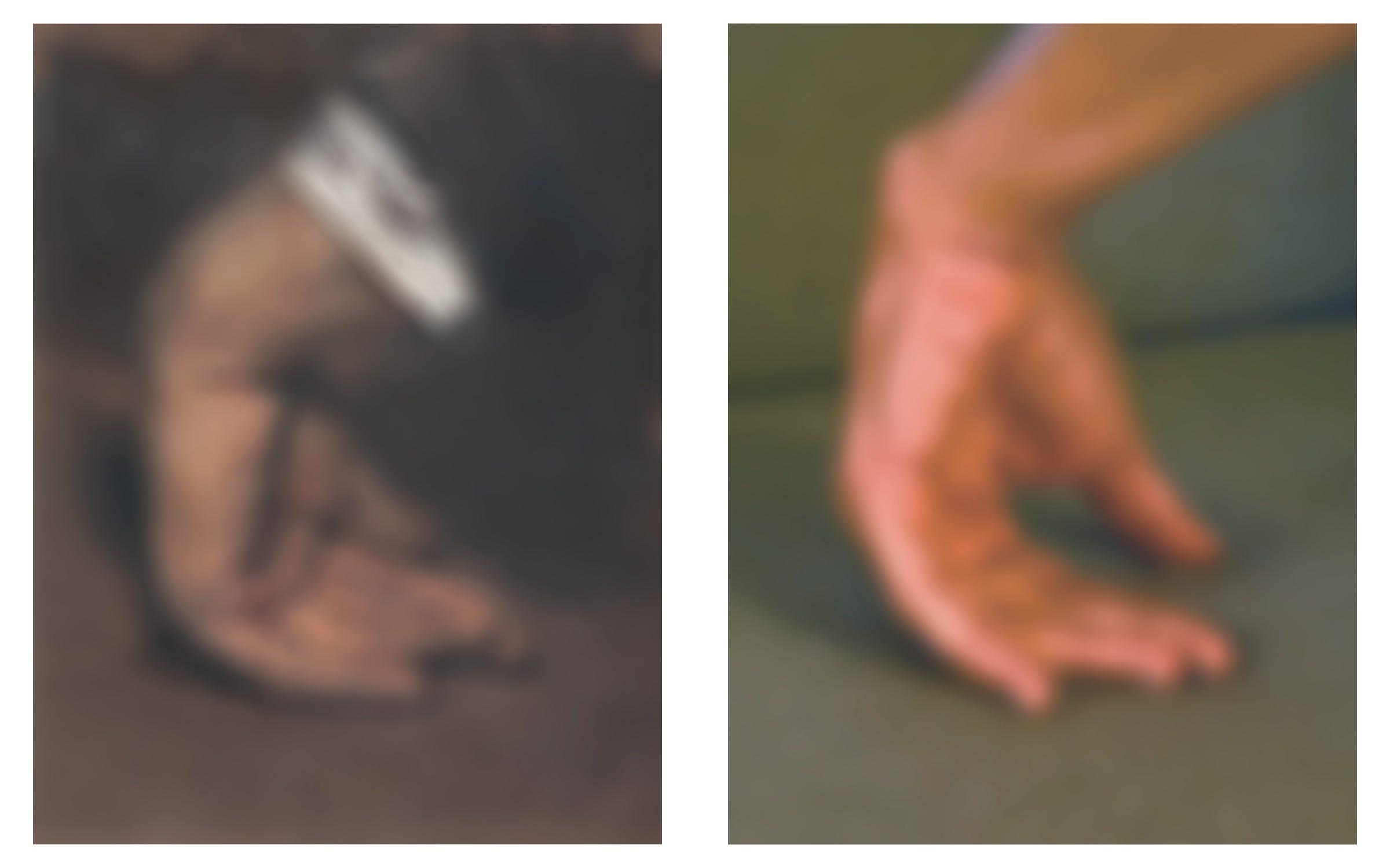
The mid-nineteenth-century hand was drawn by the German artist Adolph von Menzel. It appears to the wrist with a white shirt cuff and the edge of a brown jacket. It is dirty and its status is ambiguous—we don’t know whether it even belongs to a living person. Because it hangs somewhat lifeless, I imagine it belongs to someone drunk, someone perhaps collapsed in a chair or on apartment steps and whose limb is hanging down and the hand brushing the ground in an accidental conclusion. The most likely scene, I imagine after staring at it for a long while, based on the hand’s angle, is that of the model having passed out face down on a low park bench.
I’ve been reading art historians in the past year, which seems relevant. John Berger guides the reader through different approaches artists take to drawing something. One insight is that when we draw directly from life, the drawing may seem almost timeless—a drawing of a hand in charcoal on paper might be very similar today as it was four hundred years ago if both were drawn from direct observation. But when we draw from memory or the imagination the resulting image takes on the ideology of our time and is going to be very different from decade to decade and century to century. It will be formed by the historical moment.
How does this unfold in photography. How does it unfold when the attempt is to replicate a past hand in a new photograph.
I tried to replicate the hand’s shape with my own, with my longer, thinner fingers, and it felt very unnatural. The pose was so unnatural that I had to use my other hand to move individual fingers, joint by joint, into place. The pastel hand surely belongs to a man, a white man. At first I thought labourer, but the white cuff suggests something else. A homeless man who still has certain clothes. I can’t get my thumb quite right, it always looks like it is propping the hand up rather than giving in to something. A bad outcome. The online text labelled it Aufgestützte Hand, which translates to Supported Hand but the hand seems utterly unsupported and thus collapsed. It’s not likely that Menzel would have named the pastel anyway. Someone else.
I knew that no matter how much I liked the hand, both in and out of focus, I could not use it, its details wrong for representing our present agency. What qualifies as our present agency. Even so, I put the title text and author’s name on top of the Menzel and considered it as a cover. It took me far too long to realize that I myself could photograph someone else’s hand. And when I did, I thought that if I had to hire someone as a hand model then I would earn nothing for the book cover, because all of the money would be given to the model. Even someone that I know, I would feel obliged to pay them. People don’t have time, that is my age and that is our age.
A second insight about out of focus: the central object, once figure, becomes ground. The whole image becomes ground, which you can clearly see when you put in-focus text on top, which becomes the figure by being sharply in focus. Perhaps Oliver Munday had been thinking of Gerhard Richter’s out-of-focus and blurred paintings, figure and ground coming together, his portraits of his wives, first and second and third, and children, over decades, that intimacy of family made strange in photographic blurriness, putting their boundaries in doubt. There is that term sometimes used to describe the deterioration of the limit between the figure and ground, the informe, whose effect is to blur categorical perceptions of things like the subject, like one’s agency perhaps.
(A few months later, when I was living with Bell’s palsy, Amber would apply ointment to my left eye because it would not properly close and thus dry out. I would lie back in bed and draw my lower eyelid down, and she would squeeze a little bead of ointment along the lid. The ointment effectively turned my entire world into an out-of-focus Gerhard Richter painting, the figures and grounds merging before sleep.)
Amber and I were in our dining room during the day, daylight coming through the window, likely one of her meagre breaks from work, when I asked, Can I take a picture of your hand for a book cover. She was busy, not really answering, preoccupied with other things, household objects, to-do lists on the back of envelopes. She didn’t say no in words, but she vibed as if there would not be a time to do it. I didn’t believe it was a big ask for her to pose her hand for a picture. I imagined it taking a minute or two. She was already present after all.
There was a lot of silence around the question telling me no, I thought unreasonably telling me no2. But still there was enough ambiguity that I persisted.
Can we do it now? Otherwise deferred later and later, tomorrow and the next day, and I was worried about time and also had no idea whether her hand would actually work as a cover image and thus whether I would need much more time to develop something altogether different. I believed the hand was all that I had, no other ideas, not even lesser ones.
On our dining table, a sand-coloured tablecloth with thin red stripes. I pushed aside whatever objects were on it and Amber put her hand down. I compared her hand to the Menzel pastel on my screen and manipulated it so that it would look the same, so that it would take on those qualities that I liked about the Menzel. I helped her bend the fingers at their joints individually. The thumb was the most difficult part. And the extreme bend of the wrist. Strangely this did not feel intimate. Lighting the hand was a problem, too contrasty, and the background beyond the tablecloth busy and bright beside a south-facing window. I thought of how I had studied photography at NSCAD, where I first read “Ideology and Ideological State Apparatuses,” the essay that I refer to at the start of this essay, and retained almost nothing. Time and technology had deskilled me. What deskilling decades.
Amber suggested the couch in our dark living room. A mid-tone grey and particularly drab when the bright pillows are taken away. The poor lighting was what I was looking for—a low contrast light. She set up her hand and I gently manipulated it into that unnatural posture, making the thumb less of a tripod leg. I treated her hand like a thing, pushing it toward something crumpled and defeated, but not really attaining those qualities, not nearly as much as the Menzel. Is that how I wanted to visually represent the idea of agency? We didn’t achieve the same amount of defeat as the Menzel, but that is likely good. Ours was more ambiguous and I hoped there was tension in that ambiguity that would hold the eye and that could be read in relation to the book title. I would never have come up with a hand position like that had not copied the strange pastel from one hundred and seventy-five years ago. Because of having been called upon, I asked my wife to stage her hand like a drunk from that many years ago.
A few days later, the author of the book has decided on one of the iterations I sent him. The hand is clearly a woman’s but beyond that—the age, the race—are really hard to know. It did its best to lack culture and history, however impossible that task is. The lighting, the colours of the hand against the background. Some pink and brown against the grey couch which through colour adjustments became bluish and greenish, some depth and luminosity, at least on the computer screen. It felt like a living hand.
I said, Amber, your hand is going to be on the cover of a Routledge book. We were in the kitchen working on dinner, standing and not looking at each other. We have Routledge books on our bookshelves: on hers, the Stephen Bottoms and Matthew Goulish edited Small Acts of Repair, which she must have bought after having a performance art course with Goulish. That was some time ago. I was still picturing the Routledge R logo on books of my early art-school years, the 1990s when I first read theory, but after some thought I realized I was picturing the Blackwell B instead. When we tell our boys, I said to Amber, they will think you are famous. Your hand on the cover of a book. In the past the boys have associated books with fame. I thought it was a funny image, our boys imagining fame from an anonymous hand.
She appeared unenthused by all of it. A faraway expression, her complete indifference, she had retreated. It seemed in defense. I felt then that I’d forced her to do something, that my assumption, my desire to make something good, became a force. I was wrapped up in myself, having gone through the struggle of making a cover and coming out the other side with what I thought was a very good cover. There is often the narrowest of gazes when making something like a design.
In the story about the cop calling out, the receiver reacts by turning to the caller, knowing that the call is for them. And we find out later that it need not be a cop because the call has already been made before the receiver was born. The cop is really just to give a little narrative, however brief, a little something for the abstract idea to hold on to. And it works. That cop and his interpellation was the only thing I remembered from the essay. There’s something almost antiquated to that call. Maybe that’s why the nouvelle vague, the black and white.
But I wonder whether the importance of the receiver turning their head is that it leaves open the chance, even extremely slight, of not turning. Even if impossible, there is that imagined space.
A book cover, like the representation of a hand, is not in me. It is never in me. A book cover is an accident. I look for the book cover, out there. Accidents make a book cover. The more activity you do, the more accidents happen. I have no vision that comes from within. You come across images and call them your own. You send mockups to the author and publisher and perhaps they don’t like them but are not sure why. You take them apart and more accidents happen. You go to sleep because the bad cover designs have ruined your eyesight. You wake up and look again at the cover for things the way that you might look for things in a forest. You might look for a special mushroom or rare bird.
When the book cover appears on the publisher’s website, I tell Amber. It has been two or three months since I sent the files off. I wanted to see how the publisher placed their R logo on the design, and whether they used white, or as I dreaded, black, which wouldn’t have gone with the colour palette. Amber asks me to send her the link, which she shares with a friend.
When, sometime still later, a colleague of hers drops by, Amber is eager to show off the cover. We don’t often have friends over, so when we do we are prone to showing them things. First they look at the screen, but then she leads her colleague to the living room and poses her hand on the couch to show where the photographing had happened, to recreate the moment. I watched from the other side of the room, not knowing what to think or feel at her enthusiasm and sharing.
Malcolm Sutton is an editor, writer, educator, and graphic designer. For the past decade he has worked as fiction editor at Book*hug Press, where he also designs many books. His first novel, Job Shadowing, was published in 2016, and his book of essays, Noise Diary, will be published in 2027 with Invisible Books. He lives and teaches in Toronto.
Bibliography
Althusser, Louis. “Ideology and Ideological State Apparatuses.” Translated by Ben Brewster. Marxists Internet Archive, marxists.org/reference/archive/althusser/1970/ideology.htm.
Footnotes
Amber: “I was twenty.”
Amber: “I wonder what I was actually grouchy about.”
